


SS26 Lookbook
For this new season, we invite you to dive deep into colour.
Seeing red, feeling blue, tickled pink, green with envy… emotions and colours share an intimate, symbolic bond. This new collection was born at the intersection of psychology and aesthetics. Many of you choose our designs based on your personality, your desires, and the messages you wish to express. This season, let your mood lead the way.
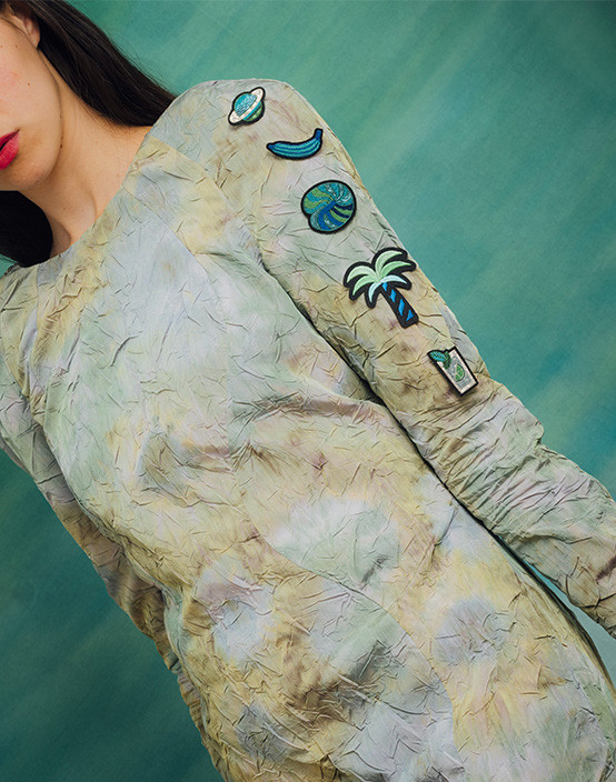
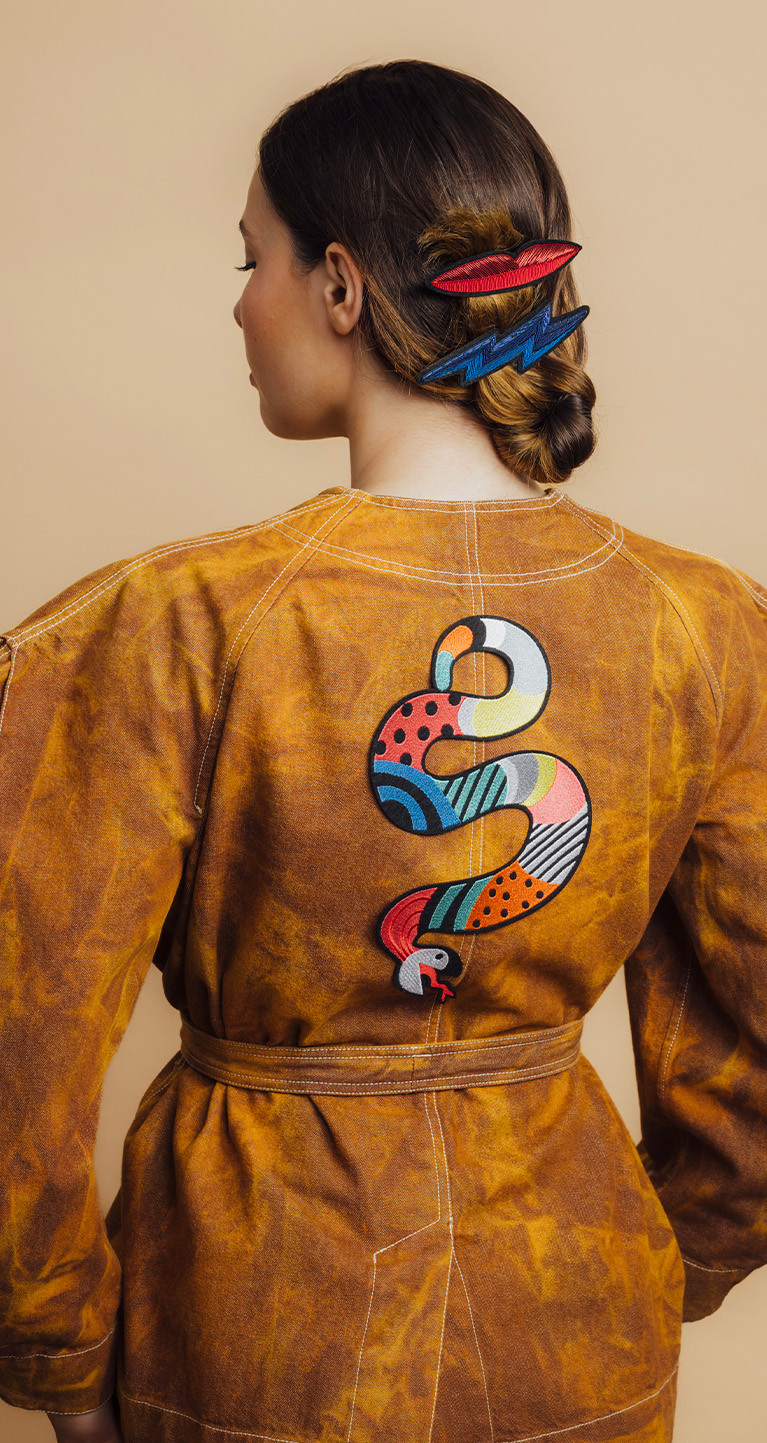
While colour is now central to our collections, it hasn’t always been. We use machine embroidery and an Indo-Pakistani embroidery technique that incorporates gold and silver “cannetille” thread. Initially, out of deep respect for tradition, we limited ourselves to the two iconic shades. But after a transformative journey to South America, a riot of colour burst into our world, bringing joy and vibrancy. This colourful awakening became part of the identity of our House.
This season, we delve deeper. We explore each hue in depth, playing with the nuances of each. The spark? A moving visit to Niki de Saint Phalle’s Tarot Garden in Tuscany.
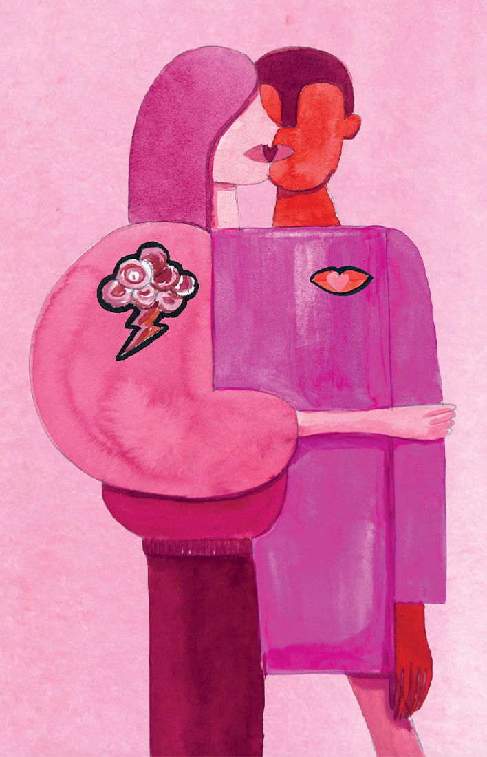
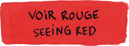
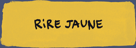
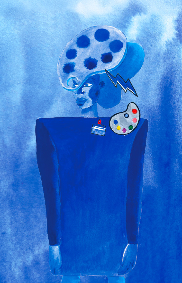
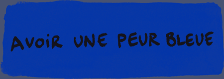
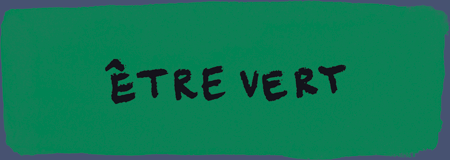
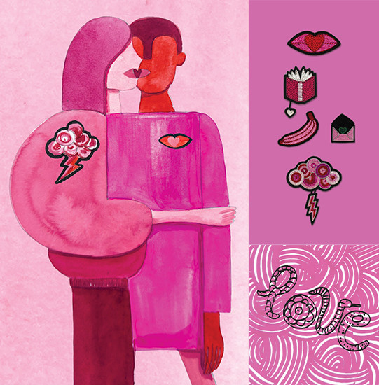
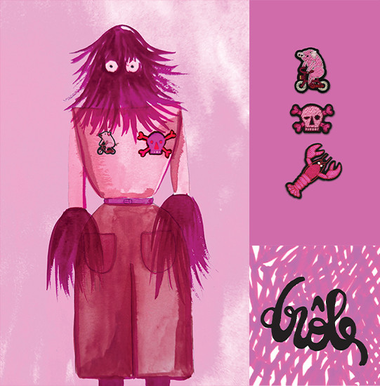
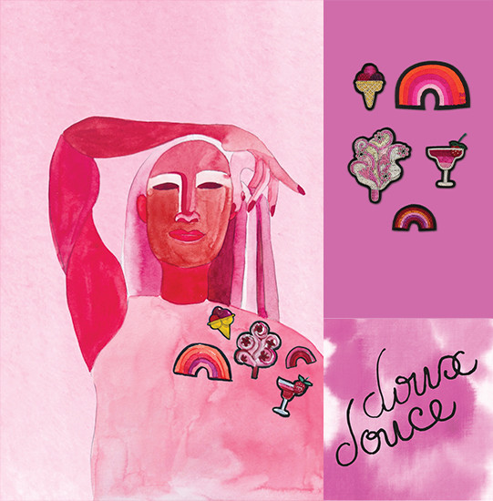
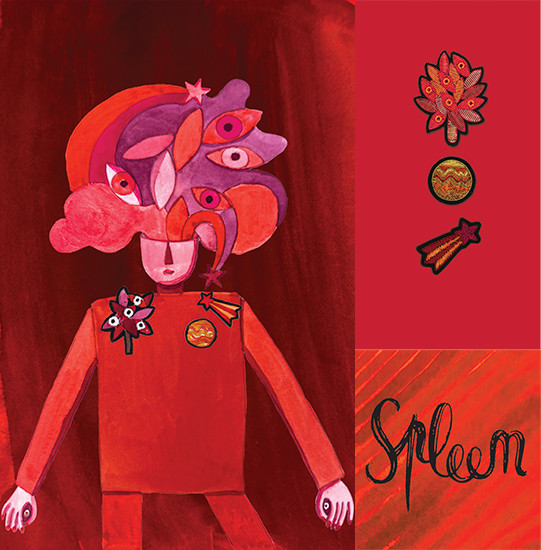
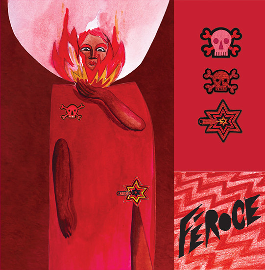
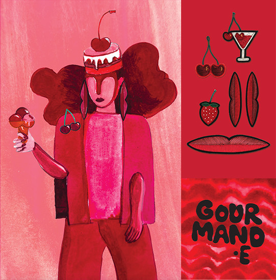
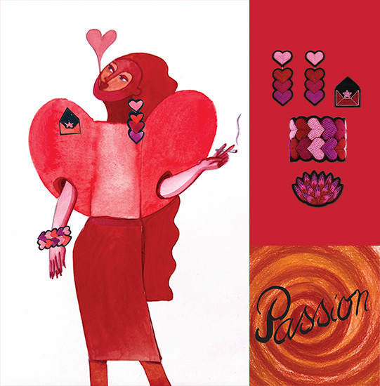
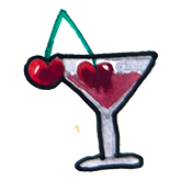
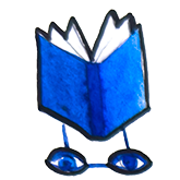
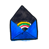
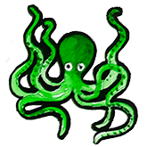
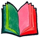
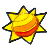
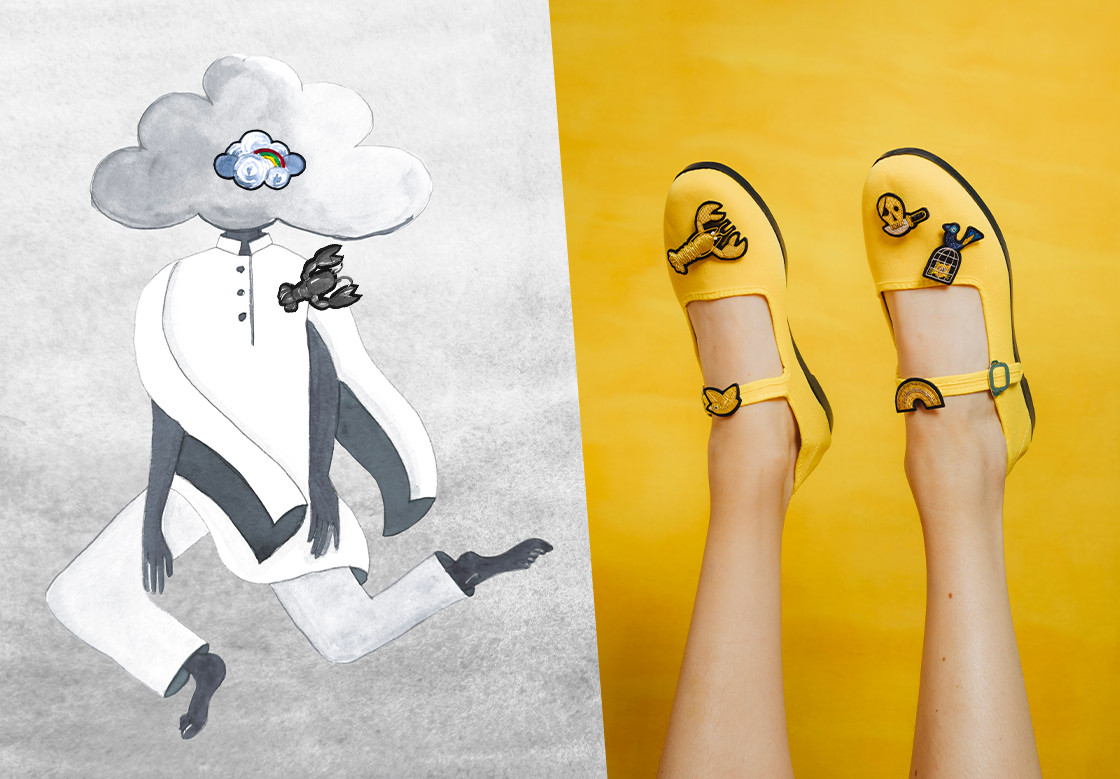
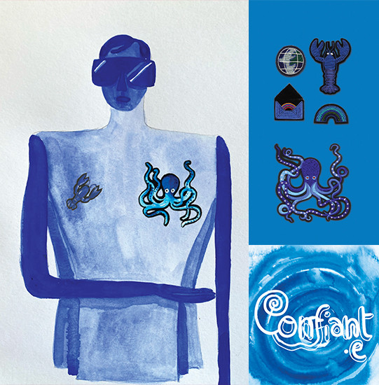
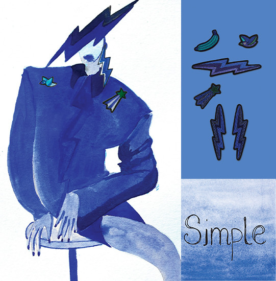
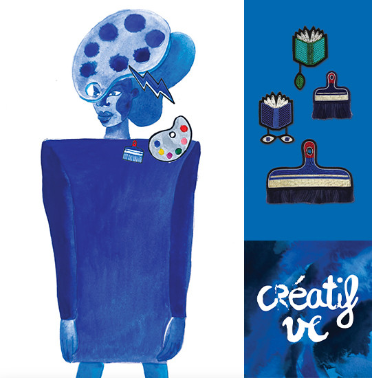
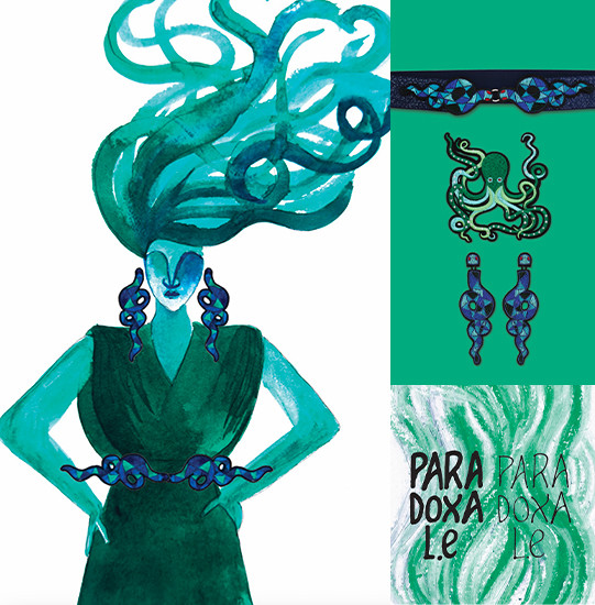
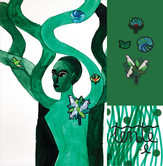
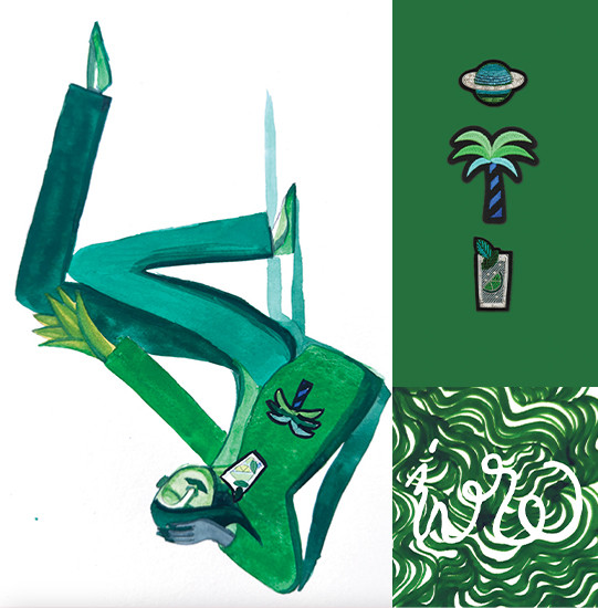
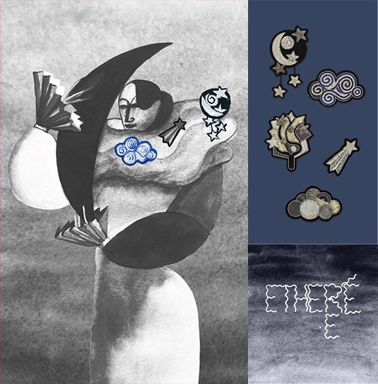
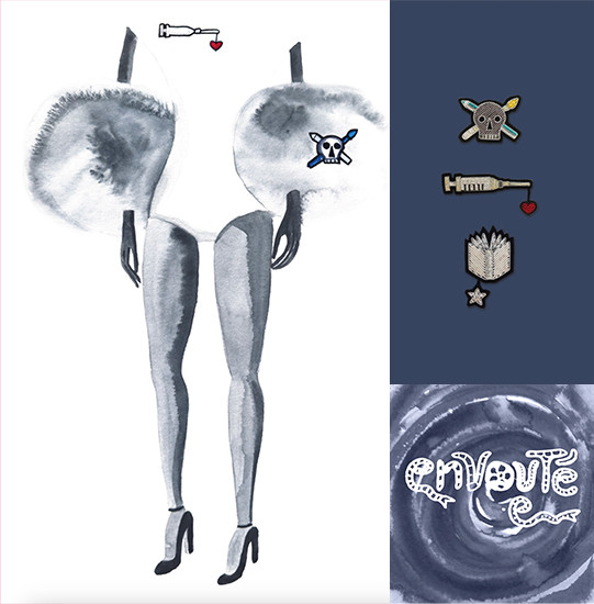
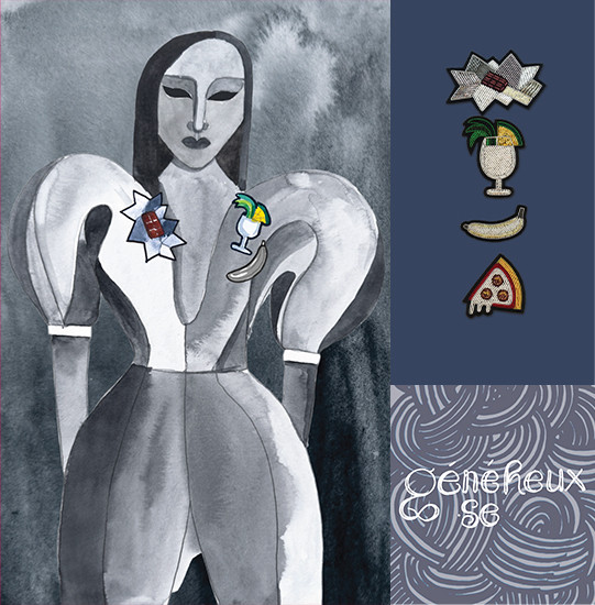
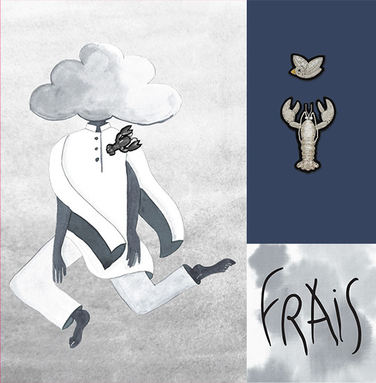
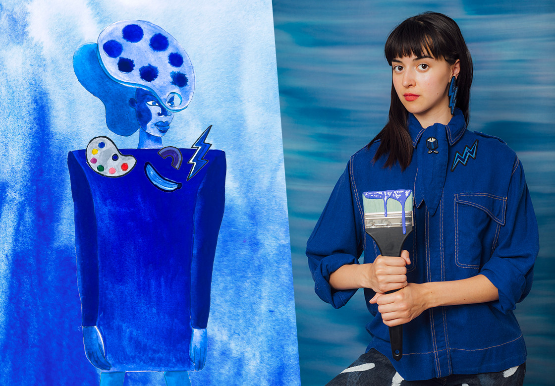
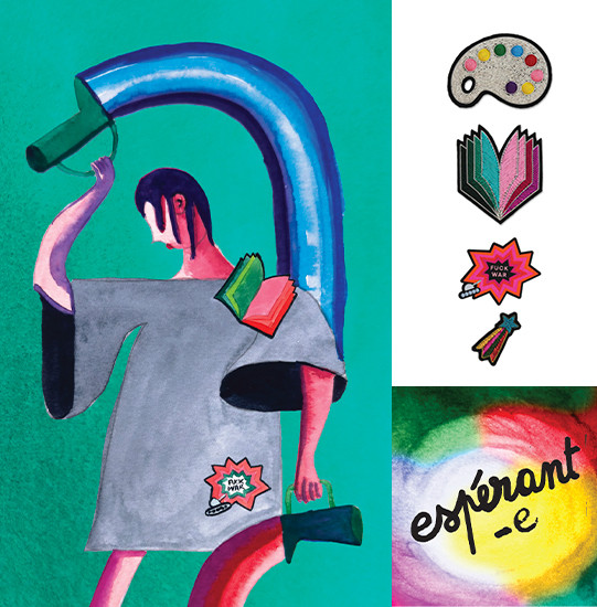
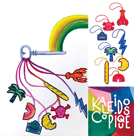
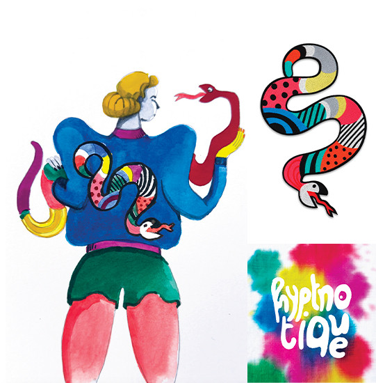
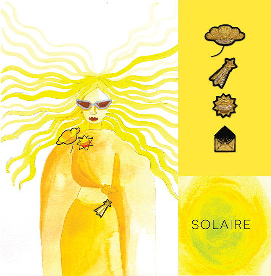
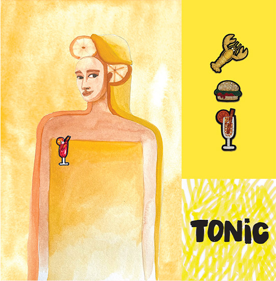
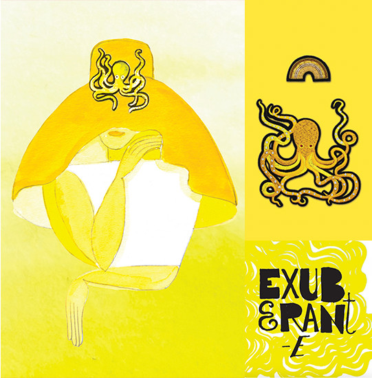
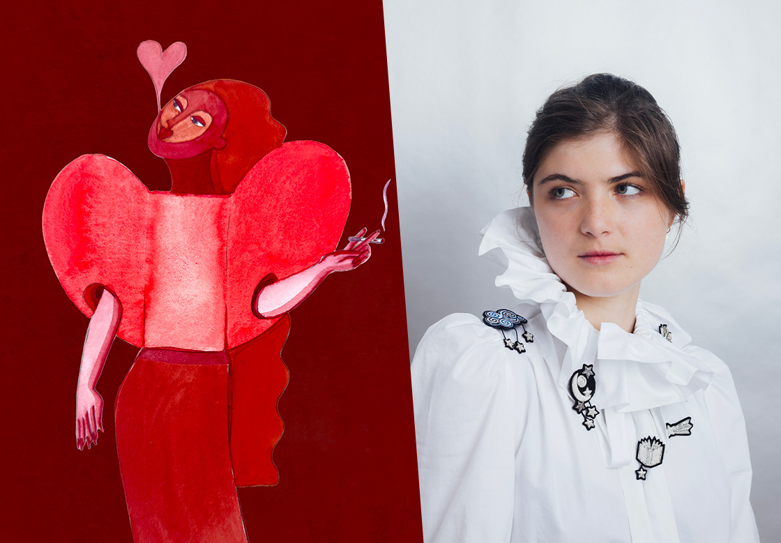
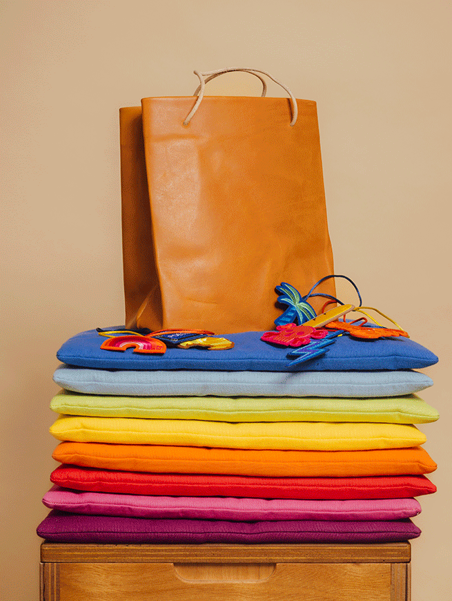
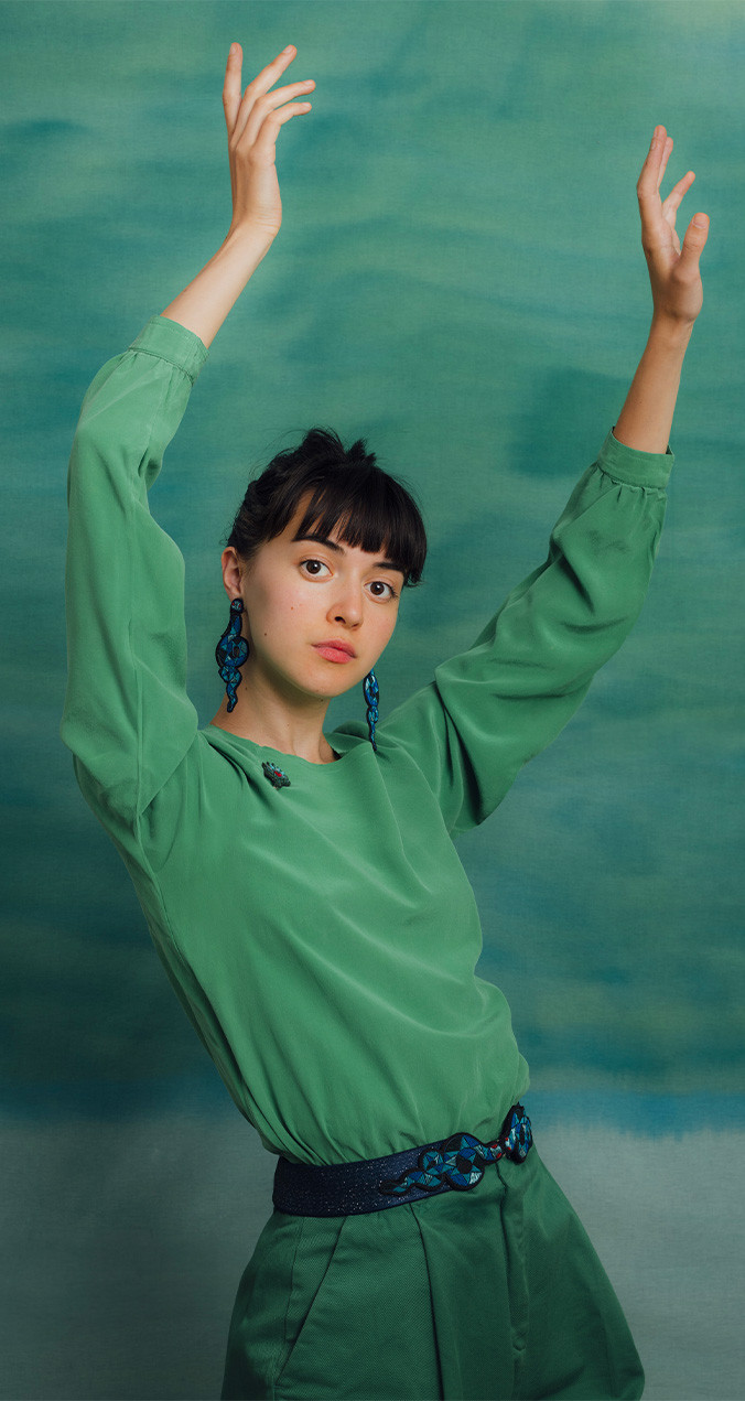
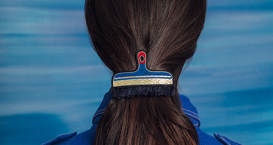
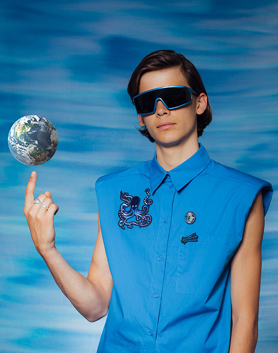
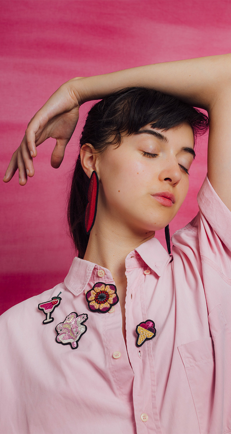
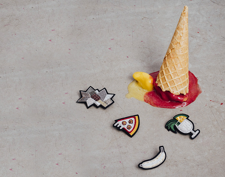
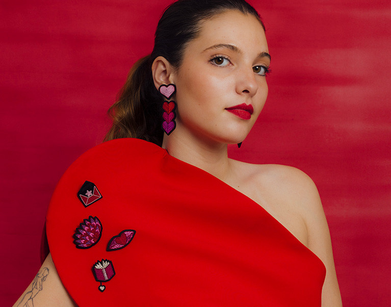
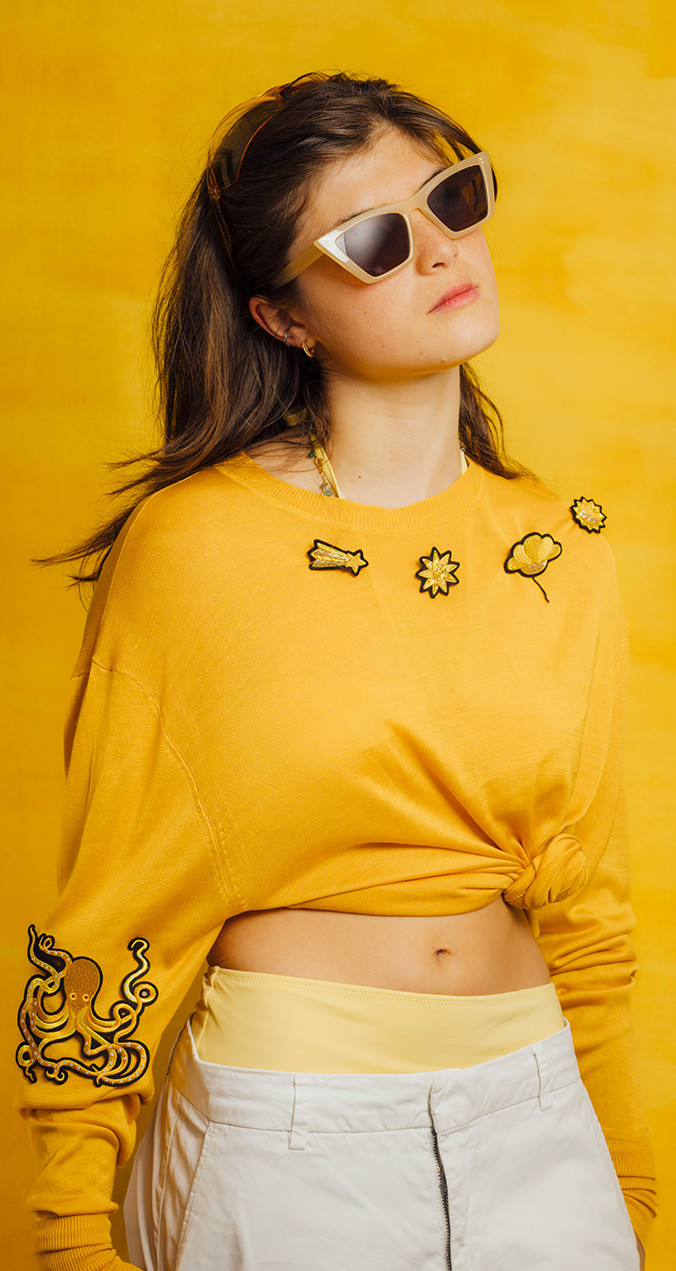
And so, we present our Colour-Feeling Palette: Red for passion, anger and rebellion; pink for tenderness, playfulness, indulgence and carnal desire; blue for serenity, confidence, the longing for freedom; green for youth, thrills, apprehension; solar yellow for energy and exuberance; white for peace, spirituality, innocence and dreams; and, finally, the "rainbow" colour, a symbol of diversity, complexity, and the many ways to belong in this world.
You might say, “Tastes and colours, there’s nothing more debatable!” That’s the point. We have drawn from our own experience and preferences to offer you ideas, embroidery and colour combinations that are entirely debatable!
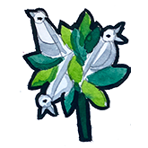
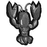
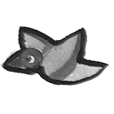
An embroidery collection doesn’t live in isolation. It needs strong imagery to support it. Instead of photographs, we chose to present this collection through drawings. * It’s a raw, fragile, intuitive exercise. It is a spontaneous way to share with you the desires, inspirations and desires that have been the source of our creations.
It is our first language of creation - what comes before planning, before stitching, before anything. After 15 years of indirect dialogue with you, we know your kindness and curiosity will allow you to feel the joy we've poured into these weekly watercolours.
This collection is a space for exchange and experimentation. We hope it will make you talkative. So please, write to us. Call, message, post, or send a carrier pigeon or flying carpet — whatever your preferred mode of expression. Whether it’s a thread or a poem, an image or a feeling, we're listening.
Because life isn’t black or white. It’s made of hundreds of shades. Joy sneaks in, one little stitch at a time. M&L offers you an embroidered colour chart, a subtle palette of feelings. Now it’s your turn to create your harmony of happiness.
We have more and more people to thank! As each year passes, more inspiring people take interest in our work. This recognition fuels and delights us.
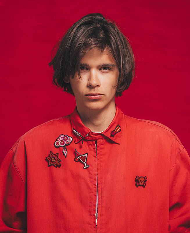
Thank you to our daily companions: Our teams in Paris and Granville as well as all external stakeholders: Fabienne, Linda, Claire Le Maréchal (thank you for lighting the spark of this new fire of joy), Papier Tigre, our families, our children, and the younger generation who inspired this catalogue: Gabriel and Marguerite and their friends. Thanks to our photographers Lucile and Clément, our photo stylist Elissa. Yes, we are talking about drawings here, but a photographic work was used as an underlay (to use an industrial designer's term).
And to the one who handed us a screwdriver when we needed it most (those who’ve built a booth at a trade fair will understand),
WE OFFER OUR SINCERE THANKS.